Reporting
The report is the audit's lasting product, and it serves two readers at once: the decision-maker, who may read only one page, and the future auditor, who must be able to reproduce the method from it. This section specifies a structure that serves both, the executive summary that carries the findings, and the presentation standards — for charts especially — that keep the results as credible on paper as they were on the scale.
Structure
The structure below is the working standard. Its logic is separation of concerns: everything a skimming reader needs sits in the first section; everything a verifying reader needs sits in the methodology and the appendices; and nothing important lives only in the middle.
| Section | Contents | Drawn from |
|---|---|---|
| 1 · Executive summary | One page: the five headline numbers, the two or three findings that matter, the ranked recommendations in brief | Everything below |
| 2 · Introduction & objectives | Why the audit was commissioned; the primary objective and the questions it was designed to answer | F-00 design brief |
| 3 · Methodology | Sampling frame, sample counts and selection, category list version, field procedure, QA tolerances, and every deviation from plan. The standard: another practitioner could repeat the study from this section alone | F-00, F-02, F-04 |
| 4 · Results | Composition by stream; generation, capture, contamination and diversion rates; stratum and seasonal breakdowns where designed; precision stated per §09 | §09 analysis |
| 5 · Observations | The F-04 log distilled: rulings, set-asides, moisture events, and context the numbers alone would not convey | F-04 |
| 6 · Recommendations | Ranked by tonnage addressed and feasibility, each traceable to a specific finding (§11) | §11 |
| 7 · Limitations | Frame boundaries, sample-size precision, seasonal coverage, moisture treatment, and anything the study cannot support — stated by the authors before a reviewer states it for them | §02, §03, §09 |
| Appendices | Sample inventory, full results tables, category definitions with version, selected photographs, blank forms | F-02, F-03, F-05, §06 |
The executive summary
Most readers stop after this page, so it is written last and to a fixed discipline: the five headline numbers with their frames stated, no chart more complex than a single bar, and recommendations expressed as actions with tonnage attached. A worked mock, using the §09 dataset:
| Generation | 560 kg per 5-day week | 0.93 kg/employee/day |
| Garbage composition | Food waste is the largest component, roughly one-third of the stream by weight | ~34% |
| Capture | Recyclables ~53% · organics ~28% — most divertible material is not reaching its stream | 53% · 28% |
| Contamination | Recycling ~12% · organics ~10% | 12% · 10% |
| Diversion | Current 32% against a potential of ~70% under existing programs | 32% → 70% |
| Recommendation 1 · Organics program relaunch targeting kitchen and staff-room streams | ~130 kg/wk | |
| Recommendation 2 · Point-of-disposal signage at the six highest-miss stations | ~95 kg/wk | |
| Recommendation 3 · Re-audit at 12 months, identical method, to evaluate both measures | §11 cycle | |
Presenting composition: a standard and an anti-pattern
Composition charts do most of a report's communicative work, and two habits keep them honest: sorted horizontal bars with the values printed, and colour meaning something (the site's stream convention). The pair below shows the same dataset both ways.
Comparisons
Three comparisons give audit results their meaning, each with a condition attached. Against the prior audit: the strongest comparison the report can make, valid only where method, categories, season and frame were held constant (§02); any change is disclosed beside the comparison, not in an appendix. Against published benchmarks: regional composition studies (§01) situate a result, but category lists rarely align exactly — benchmark comparisons are made at the stream or group level and labelled as approximate. Across seasons and strata within the study: presented as designed, with the §09 seasonal weighting shown rather than implied. When a difference is within the study's stated precision, the report says "no detectable change" — not a percentage that implies one.
The language of uncertainty
| Write | Rather than | Because |
|---|---|---|
| "Approximately one-third of the garbage stream (34%, n = 5 samples)" | "34.21% of waste" | Precision claims must match the sample count (§03); the frame must travel with the number |
| "Between roughly 25% and 45% at 90% confidence" | "34% ± 10%" (unexplained) | Interval language is self-explanatory; a bare ± invites misreading as percentage points or as certainty |
| "Indicative only — below the reliable-measurement threshold" | Reporting 0.4% HHW as a finding | Low-prevalence categories do not stabilize at audit sample sizes (§03) |
| "No detectable change from 2025" | "Diversion improved 1.8 points" | Differences inside the precision band are noise; reporting them as change invites decisions on noise |
Production notes
Four practicalities recur. Photographs are evidence: figures drawn from the F-05 log (the spread-pile record, notable findings) do more persuasive work than any chart, and each carries its sample ID in the caption. Factual review is not editorial review: the host or client reviews a draft for factual accuracy — occupancy figures, site descriptions, program details — while findings and recommendations remain the auditors'; the report notes that this review occurred. Public versions may need a plain-language layer: municipal reports often ship with a two-page public summary; in Canadian municipal contexts, French and English versions of at least the summary are frequently expected. The report is versioned like the data: date-stamped drafts, a numbered final, and the underlying workbook archived beside it (§08 retention).
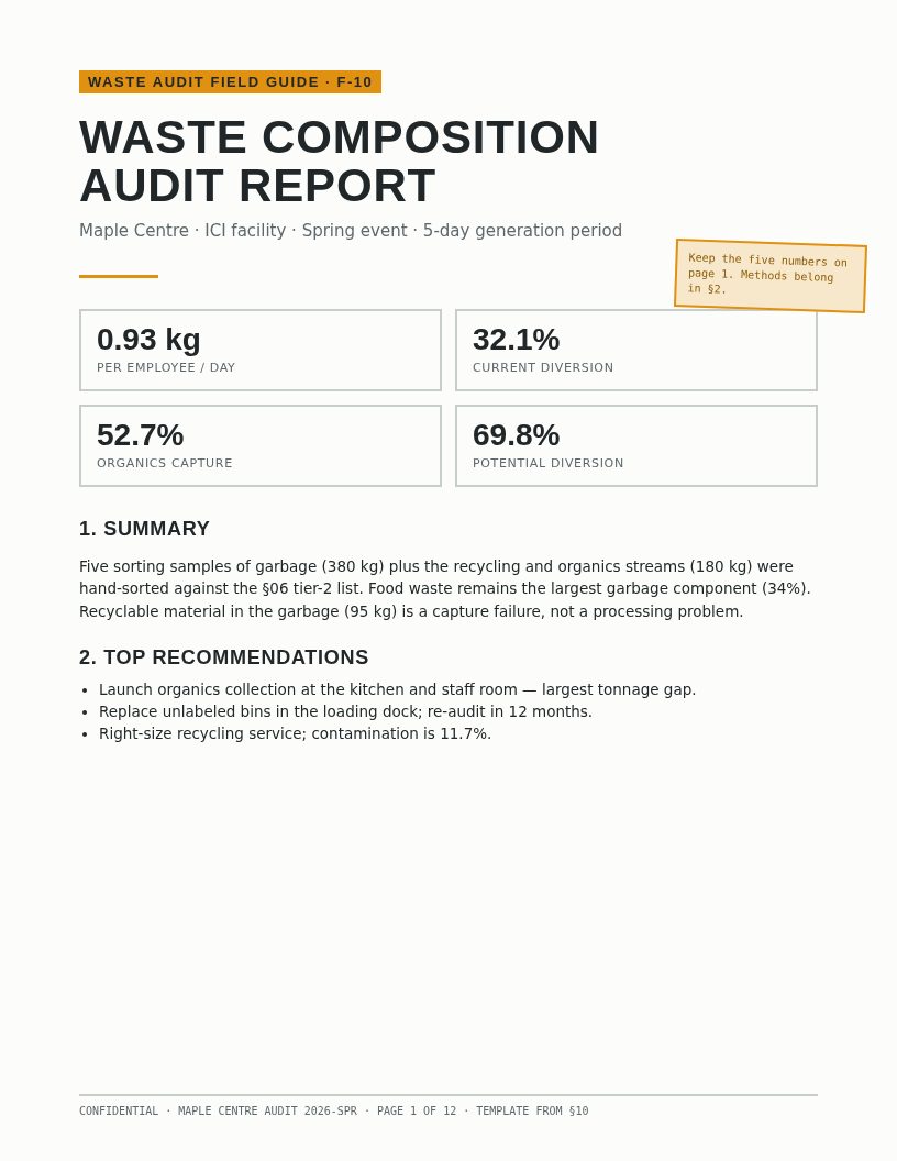
Report Template
The structure above as a formatted document: styled headings, the executive-summary page pre-built, table and figure conventions, and per-section drafting notes.
DOCX — click the sheet or the button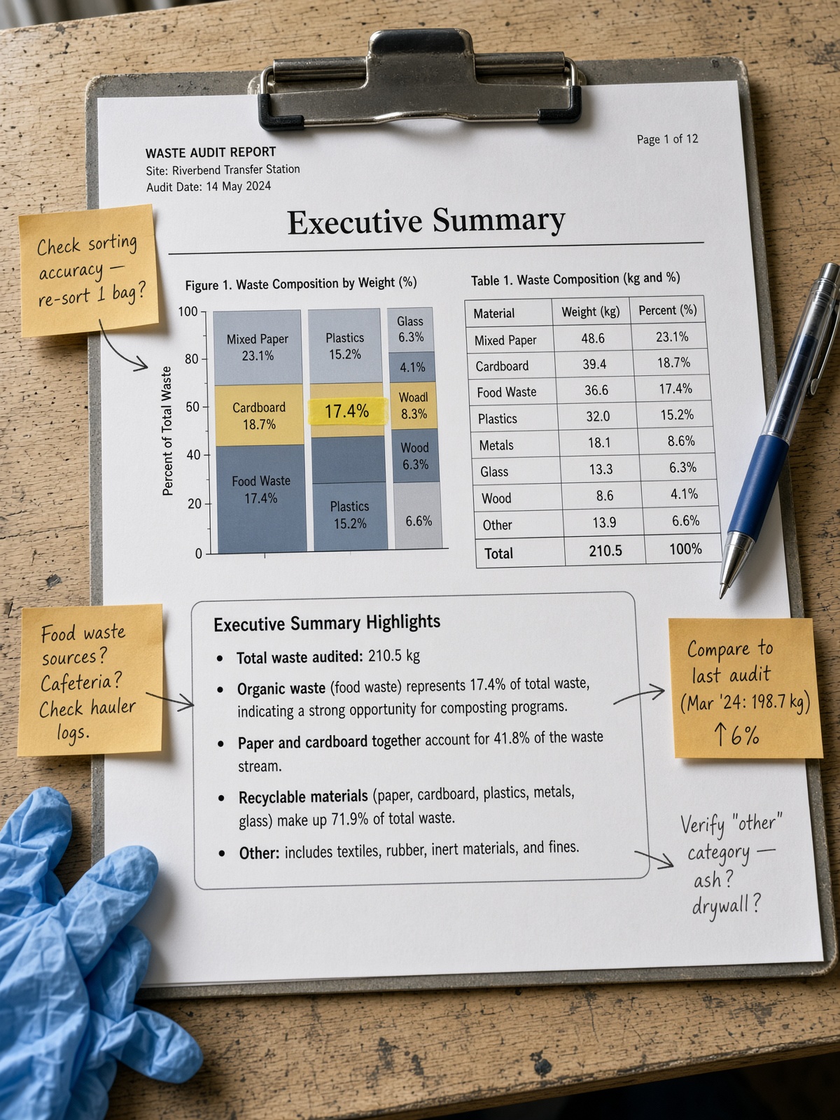
Annotated Sample Report
A completed report with margin annotations explaining why each section is built as it is — the fastest way to learn the standard is to read one done properly.
Use the template, then annotate the draft like thisSources & further reading
- Ontario Ministry of the Environment — A Guide to Waste Audits and Waste Reduction Work Plans (reporting and record-keeping expectations under O. Reg. 102/94)
- ASTM International — D5231-92(2016) (reporting requirements: mean composition, sample counts, and precision)